译自:
转载请标明出处:蒋宇捷的博客()
- - - - - -
当在图像元素上直接使用CSS3内阴影或者圆角边框时,浏览器对于CSS样式的渲染并不完美。但是,如果图像作为背景图像使用时,你可以为它添加任何样式,而且可以实现完美的渲染。Darcy Clarke和我一起编写了一个如何使用jQuery来动态创建完美圆角边框的快速教程。今天我要重启这个话题,向你展示使用CSS的背景图像技巧我们还可以做多少事情。我将向你展示如何使用盒阴影、圆角边框和转换来创建不同的图像样式。
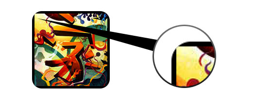
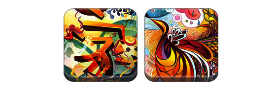
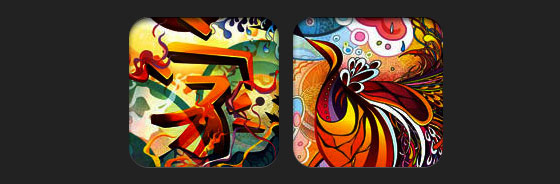
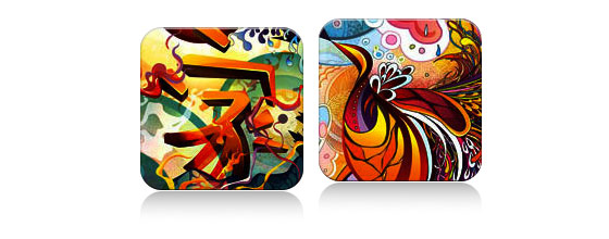
问题(见) 查看演示,你会发现第一排的图像应用了圆角边框和内阴影。Firefox在图片元素上支持圆角边框,但是不支持内阴影的渲染。Chrome和Safari完全不支持圆角边框和内阴影的渲染。
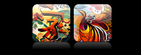
解决方案 要使用圆角边框和内阴影,解决方案是把所需的图像设置为背景图像。
动态的方式 要采用动态的方式实现,你可以使用jQuery来将每一个图像元素动态的包装为背景图像。如下的jQuery代码使用span标签来包装所有的图像,并且将图像应用为背景图像(jQuery代码来自Darcy Clarke)。
<script type="text/javascript" src="http://ajax.googleapis.com/ajax/libs/jquery/1.5/jquery.min.js"></script> <script type="text/javascript"> $(document).ready(function(){ $("img").load(function() { $(this).wrap(function(){ return '<span class="image-wrap ' + $(this).attr('class') + '" style="position:relative; display:inline-block; background:url(' + $(this).attr('src') + ') no-repeat center center; width: ' + $(this).width() + 'px; height: ' + $(this).height() + 'px;" />'; }); $(this).css("opacity","0"); }); }); </script>
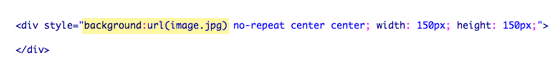
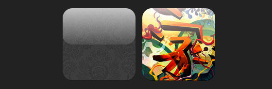
输出 上面的代码将输入如下的HTML代码:
<span class="image-wrap " style="position:relative; display:inline-block; background:url(image.jpg) no-repeat center center; width: 150px; height: 150px;"> <img src="image.jpg" style="opacity: 0;"> </span>
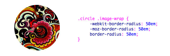
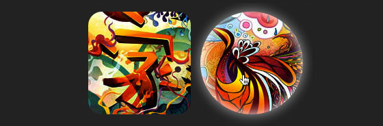
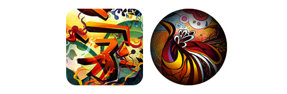
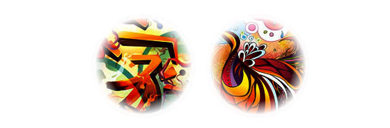
圆形图像(见) 现在图片已经被应用为背景图像,你几乎可以为它添加任何样式。如下是一个用圆角边框创建的简单圆形图像。如果你还不熟悉CSS3,请阅读我对CSS3的 。
CSS .circle .image-wrap { -webkit-border-radius: 50em; -moz-border-radius: 50em; border-radius: 50em; }
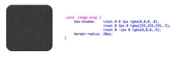
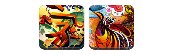
卡片风格(见) 如下是一个用多内阴影值创建的卡片图像样式。
CSS .card .image-wrap { -webkit-box-shadow: inset 0 0 1px rgba(0,0,0,.8), inset 0 2px 0 rgba(255,255,255,.5), inset 0 -1px 0 rgba(0,0,0,.4); -moz-box-shadow: inset 0 0 1px rgba(0,0,0,.8), inset 0 2px 0 rgba(255,255,255,.5), inset 0 -1px 0 rgba(0,0,0,.4); box-shadow: inset 0 0 1px rgba(0,0,0,.8), inset 0 2px 0 rgba(255,255,255,.5), inset 0 -1px 0 rgba(0,0,0,.4); -webkit-border-radius: 20px; -moz-border-radius: 20px; border-radius: 20px; }
浮雕风格(见) 做一些调整,我可以将卡片样式变成浮雕样式。
CSS .embossed .image-wrap { -webkit-box-shadow: inset 0 0 2px rgba(0,0,0,.8), inset 0 2px 0 rgba(255,255,255,.5), inset 0 -7px 0 rgba(0,0,0,.6), inset 0 -9px 0 rgba(255,255,255,.3); -moz-box-shadow: inset 0 0 2px rgba(0,0,0,.8), inset 0 2px 0 rgba(255,255,255,.5), inset 0 -7px 0 rgba(0,0,0,.6), inset 0 -9px 0 rgba(255,255,255,.3); box-shadow: inset 0 0 2px rgba(0,0,0,.8), inset 0 2px 0 rgba(255,255,255,.5), inset 0 -7px 0 rgba(0,0,0,.6), inset 0 -9px 0 rgba(255,255,255,.3); -webkit-border-radius: 20px; -moz-border-radius: 20px; border-radius: 20px; }
软浮雕风格(见) 这几乎和浮雕样式相同,我只加了1个像素的模糊。
CSS .embossed .image-wrap { -webkit-box-shadow: inset 0 0 2px rgba(0,0,0,.8), inset 0 2px 0 rgba(255,255,255,.5), inset 0 -7px 0 rgba(0,0,0,.6), inset 0 -9px 0 rgba(255,255,255,.3); -moz-box-shadow: inset 0 0 2px rgba(0,0,0,.8), inset 0 2px 0 rgba(255,255,255,.5), inset 0 -7px 0 rgba(0,0,0,.6), inset 0 -9px 0 rgba(255,255,255,.3); box-shadow: inset 0 0 2px rgba(0,0,0,.8), inset 0 2px 0 rgba(255,255,255,.5), inset 0 -7px 0 rgba(0,0,0,.6), inset 0 -9px 0 rgba(255,255,255,.3); -webkit-border-radius: 20px; -moz-border-radius: 20px; border-radius: 20px; }
剪贴画风格(见) 再次通过对内阴影的调整,我可以让它看起来像一个剪贴画效果。
CSS .cut-out .image-wrap { -webkit-box-shadow: 0 1px 0 rgba(255,255,255,.2), inset 0 4px 5px rgba(0,0,0,.6), inset 0 1px 0 rgba(0,0,0,.6); -moz-box-shadow: 0 1px 0 rgba(255,255,255,.2), inset 0 4px 5px rgba(0,0,0,.6), inset 0 1px 0 rgba(0,0,0,.6); box-shadow: 0 1px 0 rgba(255,255,255,.2), inset 0 4px 5px rgba(0,0,0,.6), inset 0 1px 0 rgba(0,0,0,.6); -webkit-border-radius: 20px; -moz-border-radius: 20px; border-radius: 20px; }
变形和发光(见) 在这个例子汇总,我为图像的包装元素添加了transition。当鼠标滑过,它会从圆角边框变为圆形并添加发光的效果。发光效果采用多盒阴影值实现。
CSS .morphing-glowing .image-wrap { -webkit-transition: 1s; -moz-transition: 1s; transition: 1s; -webkit-border-radius: 20px; -moz-border-radius: 20px; border-radius: 20px; } .morphing-glowing .image-wrap:hover { -webkit-box-shadow: 0 0 20px rgba(255,255,255,.6), inset 0 0 20px rgba(255,255,255,1); -moz-box-shadow: 0 0 20px rgba(255,255,255,.6), inset 0 0 20px rgba(255,255,255,1); box-shadow: 0 0 20px rgba(255,255,255,.6), inset 0 0 20px rgba(255,255,255,1); -webkit-border-radius: 60em; -moz-border-radius: 60em; border-radius: 60em; }
光泽覆盖(见) 我们采用:after伪类元素实现如下的光泽渐变覆盖效果。
CSS .glossy .image-wrap { -webkit-box-shadow: inset 0 -1px 0 rgba(0,0,0,.5); -moz-box-shadow: inset 0 -1px 0 rgba(0,0,0,.5); box-shadow: inset 0 -1px 0 rgba(0,0,0,.5); -webkit-border-radius: 20px; -moz-border-radius: 20px; border-radius: 20px; } .glossy .image-wrap:after { position: absolute; content: ' '; width: 100%; height: 50%; top: 0; left: 0; -webkit-border-radius: 20px; -moz-border-radius: 20px; border-radius: 20px; background: -moz-linear-gradient(top, rgba(255,255,255,0.7) 0%, rgba(255,255,255,.1) 100%); background: -webkit-gradient(linear, left top, left bottom, color-stop(0%,rgba(255,255,255,0.7)), color-stop(100%,rgba(255,255,255,.1))); background: linear-gradient(top, rgba(255,255,255,0.7) 0%,rgba(255,255,255,.1) 100%); }
投影(见) 在这个例子中,我将覆盖渐变换到底部来创建投影效果。
CSS .reflection .image-wrap:after { position: absolute; content: ' '; width: 100%; height: 30px; bottom: -31px; left: 0; -webkit-border-top-left-radius: 20px; -webkit-border-top-right-radius: 20px; -moz-border-radius-topleft: 20px; -moz-border-radius-topright: 20px; border-top-left-radius: 20px; border-top-right-radius: 20px; background: -moz-linear-gradient(top, rgba(0,0,0,.3) 0%, rgba(255,255,255,0) 100%); background: -webkit-gradient(linear, left top, left bottom, color-stop(0%,rgba(0,0,0,.3)), color-stop(100%,rgba(255,255,255,0))); background: linear-gradient(top, rgba(0,0,0,.3) 0%,rgba(255,255,255,0) 100%); } .reflection .image-wrap:hover { position: relative; top: -8px; }
光泽和投影(见) 在这个示例中,我将:before和:after合并,用来创建带投影效果的光泽头像。
CSS .glossy-reflection .image-wrap { -webkit-box-shadow: inset 0 -1px 0 rgba(0,0,0,.5), inset 0 1px 0 rgba(255,255,255,.6); -moz-box-shadow: inset 0 -1px 0 rgba(0,0,0,.5), inset 0 1px 0 rgba(255,255,255,.6); box-shadow: inset 0 -1px 0 rgba(0,0,0,.5), inset 0 1px 0 rgba(255,255,255,.6); -webkit-transition: 1s; -moz-transition: 1s; transition: 1s; -webkit-border-radius: 20px; -moz-border-radius: 20px; border-radius: 20px; } .glossy-reflection .image-wrap:before { position: absolute; content: ' '; width: 100%; height: 50%; top: 0; left: 0; -webkit-border-radius: 20px; -moz-border-radius: 20px; border-radius: 20px; background: -moz-linear-gradient(top, rgba(255,255,255,0.7) 0%, rgba(255,255,255,.1) 100%); background: -webkit-gradient(linear, left top, left bottom, color-stop(0%,rgba(255,255,255,0.7)), color-stop(100%,rgba(255,255,255,.1))); background: linear-gradient(top, rgba(255,255,255,0.7) 0%,rgba(255,255,255,.1) 100%); } .glossy-reflection .image-wrap:after { position: absolute; content: ' '; width: 100%; height: 30px; bottom: -31px; left: 0; -webkit-border-top-left-radius: 20px; -webkit-border-top-right-radius: 20px; -moz-border-radius-topleft: 20px; -moz-border-radius-topright: 20px; border-top-left-radius: 20px; border-top-right-radius: 20px; background: -moz-linear-gradient(top, rgba(230,230,230,.3) 0%, rgba(230,230,230,0) 100%); background: -webkit-gradient(linear, left top, left bottom, color-stop(0%,rgba(230,230,230,.3)), color-stop(100%,rgba(230,230,230,0))); background: linear-gradient(top, rgba(230,230,230,.3) 0%,rgba(230,230,230,0) 100%); }
磁带风格(见) 这里使用:after来在图像的上部创建磁带式的渐变。
CSS .tape .image-wrap { -webkit-box-shadow: inset 0 0 2px rgba(0,0,0,.7), inset 0 2px 0 rgba(255,255,255,.3), inset 0 -1px 0 rgba(0,0,0,.5), 0 1px 3px rgba(0,0,0,.4); -moz-box-shadow: inset 0 0 2px rgba(0,0,0,.7), inset 0 2px 0 rgba(255,255,255,.3), inset 0 -1px 0 rgba(0,0,0,.5), 0 1px 3px rgba(0,0,0,.4); box-shadow: inset 0 0 2px rgba(0,0,0,.7), inset 0 2px 0 rgba(255,255,255,.3), inset 0 -1px 0 rgba(0,0,0,.5), 0 1px 3px rgba(0,0,0,.4); } .tape .image-wrap:after { position: absolute; content: ' '; width: 60px; height: 25px; top: -10px; left: 50%; margin-left: -30px; border: solid 1px rgba(137,130,48,.2); background: -moz-linear-gradient(top, rgba(254,243,127,.6) 0%, rgba(240,224,54,.6) 100%); background: -webkit-gradient(linear, left top, left bottom, color-stop(0%,rgba(254,243,127,.6)), color-stop(100%,rgba(240,224,54,.6))); background: linear-gradient(top, rgba(254,243,127,.6) 0%,rgba(240,224,54,.6) 100%); -webkit-box-shadow: inset 0 1px 0 rgba(255,255,255,.3), 0 1px 0 rgba(0,0,0,.2); }
变形和上色(见) 在如下的示例里,我使用:after元素在鼠标滑过时创建径向渐变。
CSS .morphing-tinting .image-wrap { position: relative; -webkit-transition: 1s; -moz-transition: 1s; transition: 1s; -webkit-border-radius: 20px; -moz-border-radius: 20px; border-radius: 20px; } .morphing-tinting .image-wrap:hover { -webkit-border-radius: 30em; -moz-border-radius: 30em; border-radius: 30em; } .morphing-tinting .image-wrap:after { position: absolute; content: ' '; width: 100%; height: 100%; top: 0; left: 0; -webkit-transition: 1s; -moz-transition: 1s; transition: 1s; -webkit-border-radius: 30em; -moz-border-radius: 30em; border-radius: 30em; } .morphing-tinting .image-wrap:hover:after { background: -webkit-gradient(radial, 50% 50%, 40, 50% 50%, 80, from(rgba(0,0,0,0)), to(rgba(0,0,0,1))); background: -moz-radial-gradient(50% 50%, circle, rgba(0,0,0,0) 40px, rgba(0,0,0,1) 80px); }
羽毛边圈(见) 径向渐变还可以作为遮罩使用来创建圆形的羽毛效果,如下所示。
CSS .feather .image-wrap { position: relative; -webkit-border-radius: 30em; -moz-border-radius: 30em; border-radius: 30em; } .feather .image-wrap:after { position: absolute; content: ' '; width: 100%; height: 100%; top: 0; left: 0; background: -webkit-gradient(radial, 50% 50%, 50, 50% 50%, 70, from(rgba(255,255,255,0)), to(rgba(255,255,255,1))); background: -moz-radial-gradient(50% 50%, circle, rgba(255,255,255,0) 50px, rgba(255,255,255,1) 70px); }
浏览器支持 这个技巧几乎可以工作在任何支持圆角边框、盒阴影、:after和:before的浏览器上(例如Chrome、Firefox和Safari)。不支持的浏览器会显示没有任何样式的图像。
使用你的创造力 正如你看到的一样,使用:before和:after伪元素你几乎可以创建任何图像风格。如果你有更富有创造力的图像风格,请在评论中分享。